Make it simple for people to understand ways to go further. It's important to ask, and offer a 'next step'. There are different modules that represent various pathways.
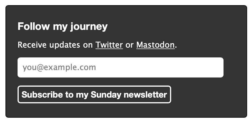
Subscribe to newsletter
Links to social media and an inline newsletter subscription form are presented with a dark-on-white colour scheme to provide the highest contrast, because it's likely the simplest way for people to 'keep in touch' passively. See ROCOGazette.
Back financially
Text describes why one would want to support me financially, and a button with a heart emoji makes it less cold, both presented with a medium contrast colour scheme as it's not likely for most people. Might be better to not include this for people 'driving by' and only display it to those who have signalled their interest in my work (by connecting with me on other channels). See OLSKJar.
Edit this
Open-source is an important aspect of what I do, but it's likely to not be a highly sought after link, so it's presented as a single link with a dashed outline. The opacity is lower than normal, but hovering makes it more vivid. See OLSKEdit.
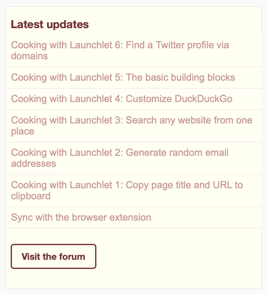
Visit the forum
Having a place to share updates, find answers, and foster dialogue should be an important part of any community-oriented project. I haven't invested much in this yet, but I plan to do this more over time. See ROCOForum.
Having these extracted in seperate modules (as linked above) helps to present them consistently across various places, similar to Announce the latest thing across projects.
Might be overwhelming to have too many. Perhaps helpful limiting to just one or two; otherwise differentiate unrelated elements with contrast.
One of the 100 steps to success.


