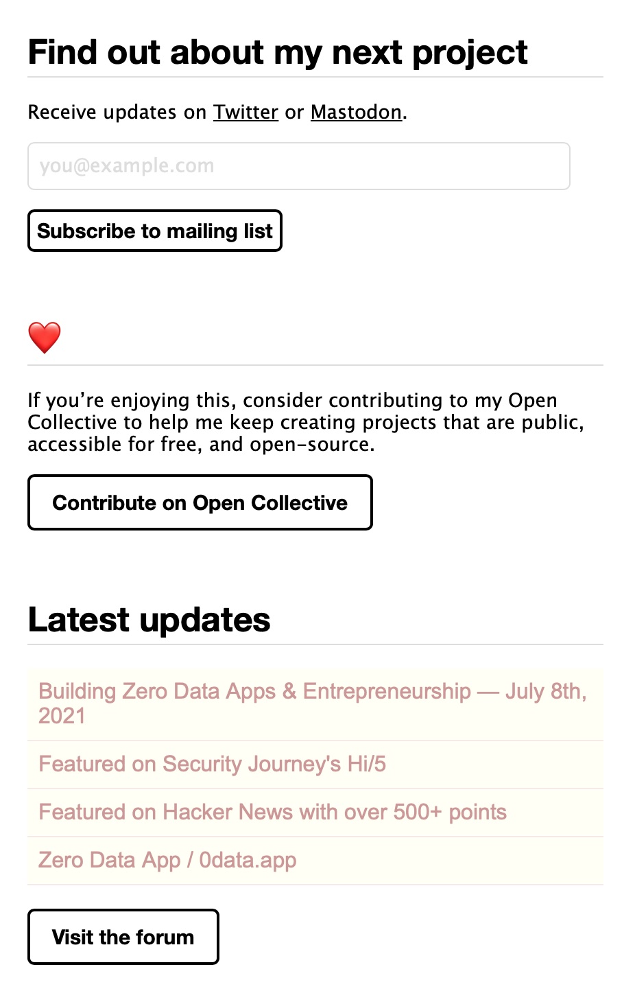
Before
A layout originally conceived for prose doesn't lend itself well to a scannable homepage. The tedious rhythm of heading, blurb, call-to-action repeats with similar styles. Sections share a similar shape and colour, so one must focus on the content by reading to understand the difference. Buttons are strong and look similar, so the eye jumps between them, leaving you paralyzed and feeling like you are being bombarded by the same question multiple times—kind of annoying.
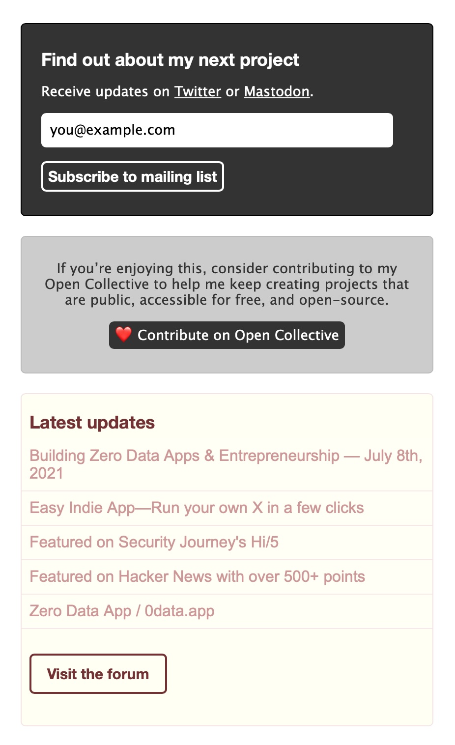
After
The eye jumps between modules, not between call-to-actions, and can more easily follow the visual hierarchy. The mailing list module has the highest contrast via an inverted white-on-black colour scheme and becomes the most prominent. The contribute module centers text to change the visuals and also the tone; moving the heart emoji to the button adds emotion to the text. Elements in the latest updates module are styled to be in harmony with the external content. See OLSKDecor (specifically OLSKDecorModule and nearby classes).
One of the 100 steps to success.