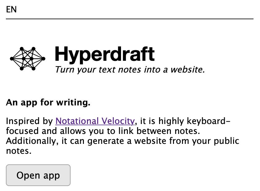
Before
The most prominent element is the name of the app and visual identity. Various text styles are competing for attention and make it feel cluttered. There lacks a clear flow for the eye to follow. The call to action is a bit faded with little contrast from the rest of the page.
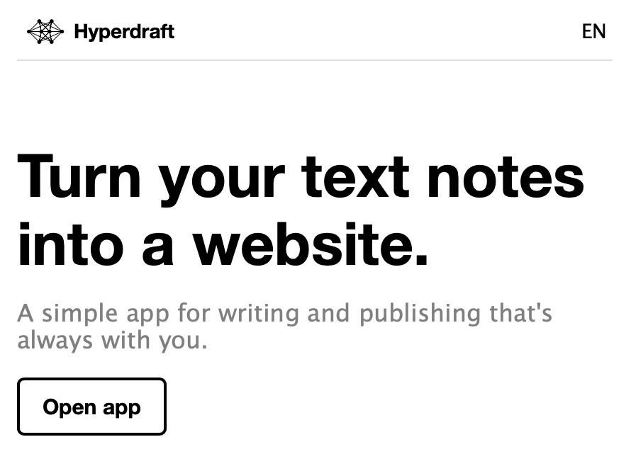
After
Inspired by a common landing page formula, the most prominent element is the 'value proposition' followed by 'how it works' and a higher-contrast call to action. The app name and visual identity are less prominent in a sticky header toolbar, accompanied by the language switching links on the opposite side. See OLSKLanding.
One of the 100 steps to success.