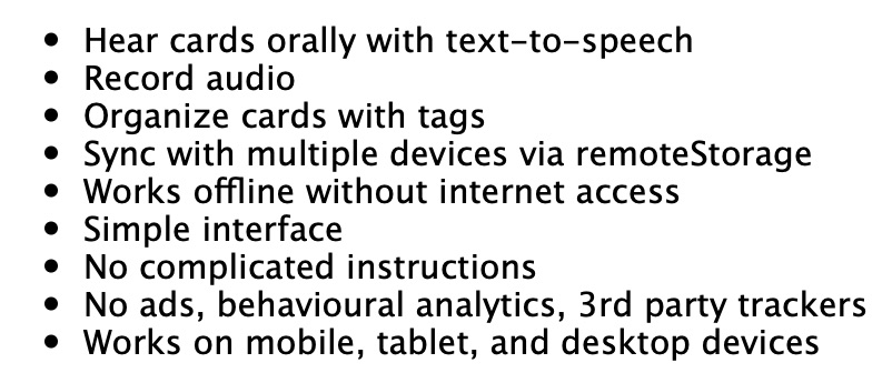
Before
The visual texture is homogenous, making it harder to read as the list gets larger, leading to the infinite content antipattern. It is necessary to read each item to know what is there.
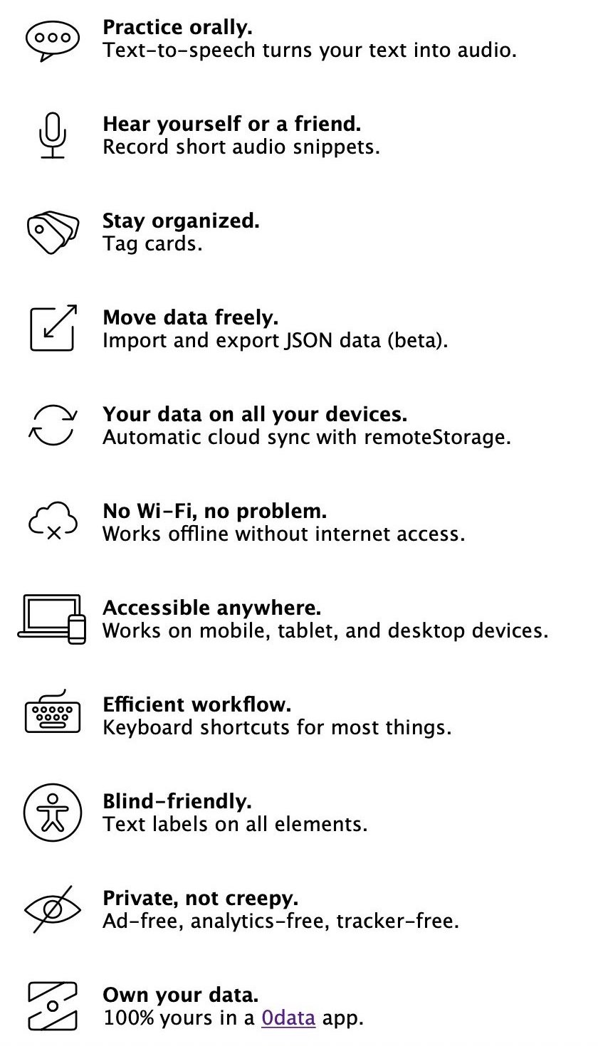
After
The items have visual cues and headings to make skimming easier. The collection of icons provides a gestalt for the 'vibe' of the app (themes of agency, data freedom, etc…). See OLSKFeatureList.
One of the 100 steps to success.